ビジネス・経済AI補助
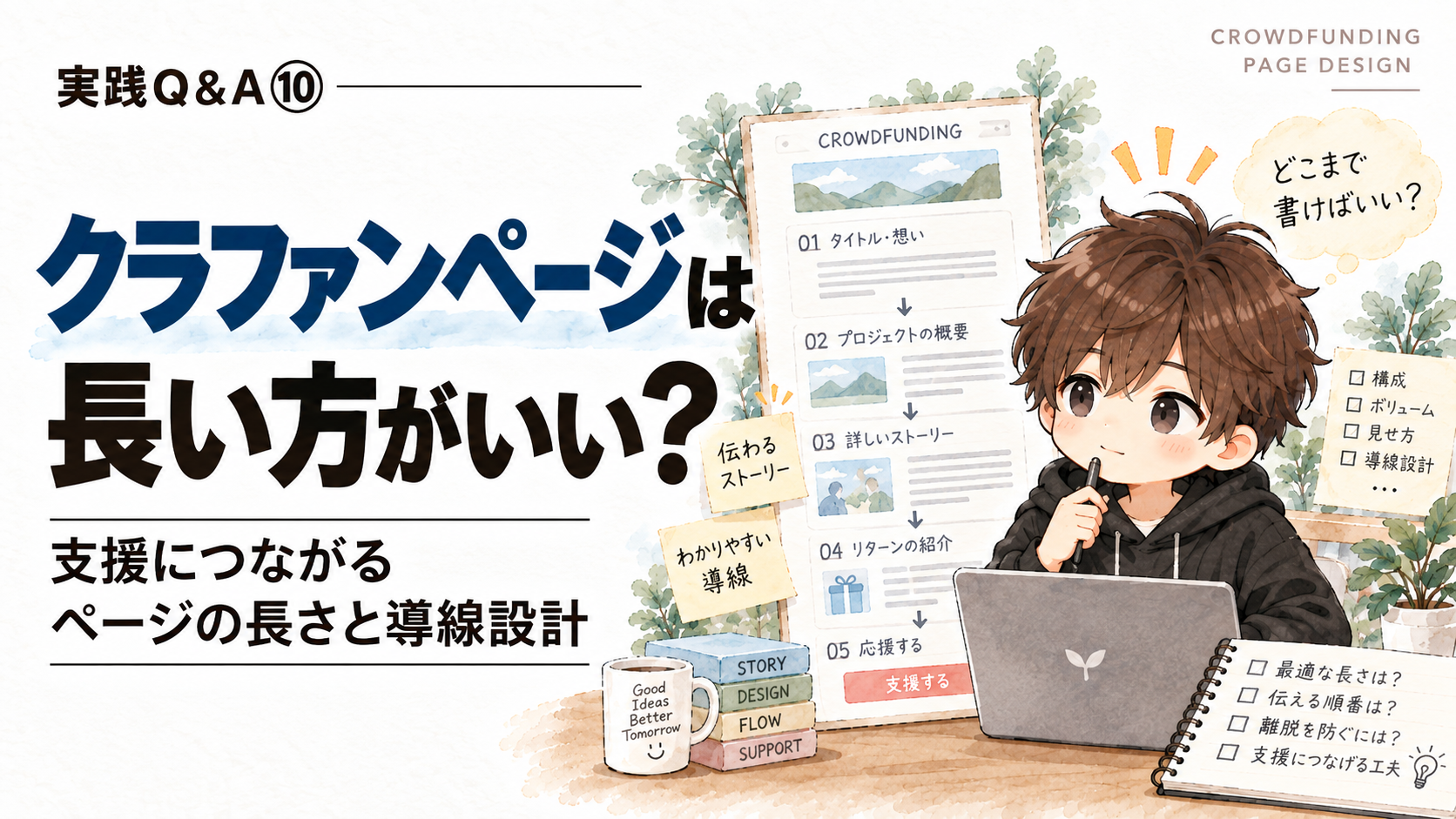
Should Crowdfunding Pages Be Long? | Page Length and Navigation Design That Leads to Backing
機械翻訳 / Machine-translated

まさと
3日前・24分で読める
"Should a crowdfunding page be long?"
It's a question I get asked often when people are building their crowdfunding pages.
They started writing what they felt, and the page just kept growing longer and longer.
On the flip side, I also hear:
"People these days don't read long text, so shouldn't you keep it as short as possible?"
My answer is:
Make it the length needed to communicate everything necessary — not long, not short.
That said, if you can convey the same thing either way,
I personally prefer shorter.
You don't need to cut information down to the point where necessary details are lost.
But if your writing involves:
— then yes, cut it.
In other words:
Not "long is fine," but "if it needs to be long, then long is fine."
That's my thinking.
This is an interesting point.
According to CAMPFIRE statistics through June 2026, projects with more characters in their body text tend to have higher goal achievement rates.
That said, I don't read this as:
"So writing long-form text makes success more likely."
Projects with more characters are likely ones that explain the following carefully:
In other words, what matters is not the character count itself, but:
Having enough information for potential backers to make their decision.
If you can convey that in 3,000 characters, there's no need to stretch it to 5,000.
When I look at a page, I'm not asking:
"How many characters does it have?"
I'm asking:
"Is there anything missing that a backer would need in order to make their decision?"
If any of these are unclear, the page may be too short.
On the other hand, if all of that comes through clearly but you're repeating the same sentiment multiple times in different words, the page may be too long.
That's why I think in terms of:
Not long or short, but "sufficient length."
And if the message gets across, shorter is less of a burden on the reader.
This is something I consider really important when building a crowdfunding page.
Not everyone who visits the page is in the same state of mind.
For example:
Some people open the page having already decided:
"If this person is running a crowdfunding campaign, I'm in."
For those people, you don't need to say:
"Please first read my entire long story."
If they've already made up their mind to back you,
Let them pick their reward and back you as smoothly as possible.
That's what matters.
The first thing I want to create is a flow like this:
Title
→ Main image
→ Summary text
→ Top of the page
→ Back this project
On CAMPFIRE, the title is considered a critical element — the first thing people see — and the main image is positioned as the "face of the project." The summary field lets you display a brief project overview in about three lines.
In other words, before the page even opens:
The title and main image.
Right after it opens:
The summary and the top of the page.
By this point, I want people to be able to determine:
"What is this crowdfunding campaign about?"
"Do I want to support this?"
If someone already wants to back the project, they can move straight from here to the rewards.
The goal isn't to get people to read to the end — it's to make it easy for them to back the project.
Of course, not everyone who opens the page will decide to back right away.
Some people will think:
"Why is this person doing this project?"
"What kind of person are they?"
"Can this really be done?"
"Is there a reason to back at this price point?"
For those people:
Give them something to keep reading.
This is where a longer page earns its place.
In other words, a crowdfunding page needs both:
A short path for people who already want to back, and
A longer path for people who need to be convinced before they can decide.
At the very top of the page, I want to communicate:
For those who think, "I already want to back this" — great, let them back it.
For those who haven't decided yet, I want to spark curiosity:
"But why are you doing this?"
From there, I lead them into:
In other words:
The top of the page isn't where the story begins — it's an entry point where readers choose to either back the project or keep reading.
As I've mentioned in previous articles, when building a page I sometimes structure things around this flow:
Everyday life
→ Making it personal
→ Interest
→ Story
→ Feelings
→ Reason to back
Rather than jumping straight into:
"I was born in __ year and…"
I start from a place where the reader thinks:
"This might actually relate to me."
Once I have their interest, I explain why this particular person is taking on this challenge.
The story should follow:
Not the order the writer wants to tell it in, but
The order the reader wants to discover it in.
This is crucial.
Another thing I want to emphasize this time is:
Designing headings and images together as a pair.
Headings aren't just there to divide up the text.
Images aren't just decorations.
I think about:
When someone sees a heading + image together, do they want to read what comes next?
For example:
"About Me"
— with a standard profile photo.
That communicates something, sure.
But what about:
"Why I'm Rebuilding the Shop I Ran for 10 Years"
— with a photo of the old shop or of the person themselves?
You'd probably think:
"What happened?"
That "I want to know a little more" reaction is what I'm going for.
Headings and images work as a trailer for the content that follows.
With longer pages especially, not everyone reads word by word from start to finish.
Some people scroll through:
So rather than headings like:
"Introduction"
"About the Project"
"Going Forward"
Make the headings carry meaning in themselves.
For example:
"It Took 3 Years to Create This Product"
"Why I Want to Preserve This Place"
"The First Thing I'll Do with ¥1,000,000"
If someone can follow just the headings and still get a sense of the overall story — and you pair those with images — the result is:
A page people can understand even without reading everything.
CAMPFIRE notes that pages with long stretches of only text become harder to read, and suggests a rough ratio of about 60% images to 40% text as a guideline.
Statistics through June 2026 also show that projects with 11 or more images or videos in the page tend to have higher goal achievement rates.
That said, my approach is not:
"I need 11 images, so I'll put in 11 images."
Instead:
Use images for things that are faster to communicate visually than in words.
That approach also keeps the overall page shorter.
I want to be clear about this.
I'm not against long pages.
But I don't think longer is better, either.
If the necessary information is all there, and you can convey the same content in:
I'll choose 500.
People who come to read a crowdfunding page aren't there to enjoy reading text for its own sake.
They're reading to understand the project and decide whether to back it.
So:
Not wasting the reader's time unnecessarily
matters too.
CAMPFIRE also recommends keeping individual sentences short, adding line breaks at appropriate intervals, and placing images throughout in a way that matches the flow of the story.
I also recommend looking at your page on a smartphone before publishing.
Not just to check that the text is legible, but to look at the full scroll experience:
And to assess:
How it flows as you scroll.
Check it not as the creator, but:
From the perspective of someone deciding whether to back.
I don't evaluate a crowdfunding page solely by whether it was read to the end.
All of those are fine.
What matters is:
Whether each person was able to reach the information they needed to make their decision.
That's why the page shouldn't be a single road everyone walks in order — it should be:
Designed so that different people can read as far as they need to.
When I'm unsure whether to cut something, I ask:
"Is this necessary for someone to decide whether to back the project?"
These are necessary:
On the other hand, these can be cut:
Don't cut necessary information to make it shorter — cut unnecessary writing.
That distinction matters a lot.
CAMPFIRE also recommends using a private preview URL to share the page with friends or acquaintances before publishing, and gathering feedback.
If I were doing that, I wouldn't just ask:
"Was it too long?"
I'd ask:
"What did you think this crowdfunding campaign was about when you first looked?"
"Where did you feel like backing?"
"Where did you stop reading?"
"Which headings or images caught your eye?"
"Was there anything you still didn't understand by the end?"
That way, rather than just the character count, you can check:
The actual navigation flow of the page.
If someone asks me:
"Should a crowdfunding page be long?"
My answer is:
Make it the length that includes all the necessary information — don't worry about long versus short.
That said:
If you can say the same thing in fewer words, shorter is better.
And:
Don't try to make everyone read to the end.
Start with:
Title → Main image → Summary → Top of the page
— and let people who are ready to back you do so right there.
For those who still aren't sure, use:
Headings + images
to create a "I want to know a little more" pull and draw them into reading further.
For those who need the full story, give it to them properly.
And at the end, build a reason for them to think:
"Yes, I want to back this project."
The purpose of a crowdfunding page is not to get people to read every word.
It's:
To deliver the information each person needs to back the project.
For people who have already decided to back:
Build the shortest possible path to completing their backing.
For people who haven't decided yet:
Use headings and images to keep their interest, and let them read the story and information they need.
That's why I think:
A crowdfunding page shouldn't be a "long page" or a "short page" — it should be a page where people can read as far as they need to.
And when the content is the same:
As short and clear as possible.
But if something is necessary for someone to decide to back the project:
Don't cut it, even if it makes the page long.
Think not from the length of the page, but:
From the perspective of the path that leads someone to backing.
That's what I keep in mind when building a crowdfunding page.
How to Build a Crowdfunding Page That Gets Backed | The "Entry Point" You Need Before a Long Story
What to Do Before Launching Your Crowdfunding Campaign | Success Starts Before You Go Live
How to Design Crowdfunding Rewards | How to Think About "Returns" That Get Backed
If you'd like to talk through your crowdfunding campaign, please check my profile page.